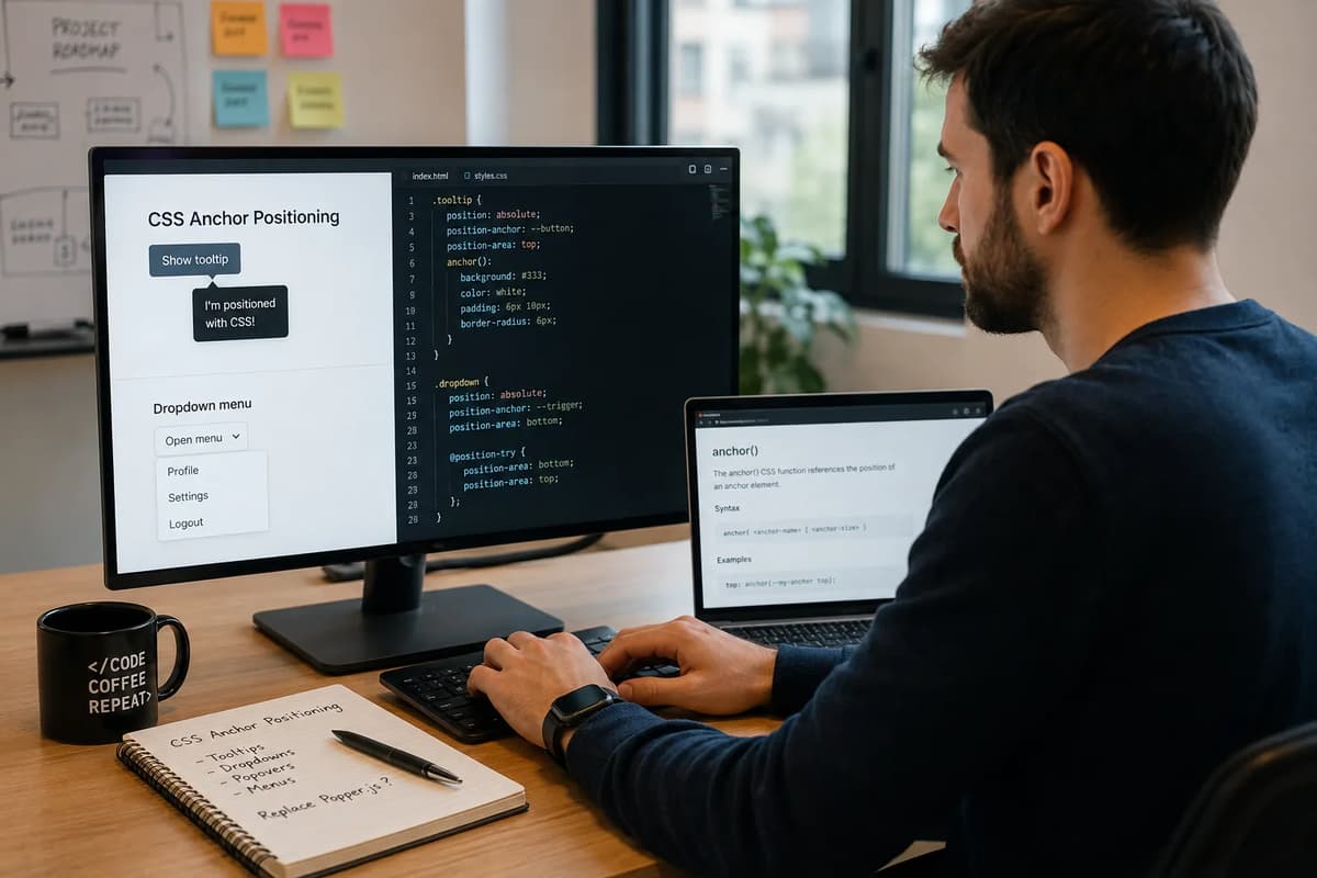
As a frontend dev who’s wired up Popper.js or Floating UI more times than I can count, the long wait is over: CSS now lets you tether tooltips, menus, and popovers natively. In January 2026, all major browsers agreed to ship the CSS Anchor Positioning feature, meaning it’s officially Baseline Newly Available. The final ship was Firefox 147 on Jan 13, 2026. In practical terms, this lets you use pure CSS (anchor-name, position-anchor, position-area, anchor(), @position-try, etc.) to position one element relative to another. That is the same job JS libraries like Popper.js and Floating UI have done. In this article, we’ll explain what exactly hit Baseline, how and why Firefox 147 was the deciding ship, and show how you can replace your JS positioning logic with CSS today. We’ll also truthfully cover the remaining quirks (a spec maintainer even called anchor positioning “still in beta” despite Baseline) and whether you can completely drop your JS library yet. (For reference, the Refonte Learning Frontend Development Program includes an Advanced CSS Techniques module that covers these modern CSS skills.)
What Just Reached Baseline in January 2026
CSS Anchor Positioning is the feature that tethers one element’s position to another’s geometry via CSS (think a tooltip anchored to a button or a popover anchored to a menu item). In January 2026, it officially attained Baseline Newly Available status: Firefox 147 (released Jan 13, 2026) added unflagged support. “Baseline” means every major browser has it, so it’s stable to use in production. Chrome and Edge (Chromium) actually led the way back in April–May 2024 with version 125, and Safari joined in September 2025 with version 26. With Firefox 147’s unflagged implementation, the last holdout fell in January 2026. That month’s Google web.dev blog proudly notes, “Firefox 147 includes support for CSS Anchor Positioning, making this feature Baseline Newly available”. In short, every modern desktop and mobile browser now implements anchor positioning (with up-to-date versions). That said, spec maintainers have flagged remaining gaps, which we’ll cover later. Baseline just means “available across browsers,” not “perfect on day one.”
Firefox 147 (Jan 13, 2026): Enabled CSS Anchor Positioning (anchor-center, position-anchor: none, etc.) by default.
Chrome/Edge 125 (May 14, 2024): First to ship anchor positioning (as part of Chromium 125).
Safari 26 (Sept 15, 2025): Added anchor positioning support as part of the Interop 2025 features.
Follow-up releases: Safari 26.1 and 26.2 in November and December 2025 fixed many anchor bugs; Firefox 148 (Feb 24, 2026) polished viewport clamping and added position-try-order.
Why Firefox 147 Was the Deciding Ship
Baseline is triggered by the “last browser” shipping the feature. Chrome/Edge and Safari had long supported anchors, so the only thing left was Firefox. In fact, spec maintainers had discussed just pushing Baseline once Firefox removed its flag. As one GitHub issue notes, “Anchor positioning is marked supported in Chrome and Safari, with Firefox behind a flag… At that point… anchor positioning as a complete unit will progress to Baseline Newly available”. Thus Firefox 147 unflagging anchor positioning in mid-Jan 2026 automatically pushed the feature to Baseline. In other words, Firefox finishing the job in January 2026 is precisely what made the Baseline announcement genuine (not 2024 or 2025).
The Three-Browser Timeline, in Full
Browser | Version (Anchor Support) | Approx. Release Date | Notes |
125 | May 14, 2024 | First to implement anchor positioning (Chromium). | |
26 | Sept 15, 2025 | Added anchor positioning as part of Interop 2025. | |
Firefox | 147 | Jan 13, 2026 | Enabled anchor positioning by default; triggered Baseline. |
Status | N/A | Jan 2026 | All major browsers implement anchor positioning. |
By April 2024, Chrome/Edge 125 shipped the full anchor feature set. Safari caught up in September 2025 (version 26), leaving just Firefox. When Firefox 147 landed with anchor-centers and new position-anchor options, the “last browser” box was checked. (As a comparison, Opera 111+ and Android/Chrome on phones followed the same schedule as desktop Chrome/Edge). The result: anchor positioning is now truly cross-browser, even on mobile Safari (iOS 26+). According to caniuse data, roughly 84% of global browser usage supports anchor positioning today (and that number will only grow with new releases).
What CSS Anchor Positioning Actually Does
CSS Anchor Positioning lets you declare in CSS that one element’s position depends on another element’s layout. Think of a tooltip or dropdown menu that should stick to its reference element; instead of JavaScript calculation, CSS can now do it. MDN explains: “The CSS anchor positioning module defines features that allow you to tether elements together. Certain elements are defined as anchor elements; anchor-positioned elements can then have their size and position set based on the size and location of the anchor elements to which they are bound.”. In practice, you mark one element as an anchor (giving it a name), and a second element as anchored (using that name). The browser then lays out the anchored element relative to its anchor’s edges or center, entirely by CSS rules.
anchor(), position-anchor, and @position-try, Explained
The key new CSS mechanics include:
anchor-name: applied to the anchor element. This gives the element a custom name (e.g. anchor-name: --btn-anchor;) that other elements can reference. It effectively marks the element as an anchor.
position-anchor: on the positioned element, this points to the anchor’s name (e.g. position-anchor: --btn-anchor;). It tells the browser which anchor to use by default. If omitted, the element uses its implicit (closest-ancestor) anchor.
anchor() function: a CSS function that can be used in numeric properties (like top/left) to get an anchor’s coordinate. For example, top: anchor(bottom); left: anchor(center) would align the positioned element’s top-left corner at the bottom-center of the anchor.
position-area (formerly inset-area): a shorthand for common alignments (e.g. top/bottom, left/right combinations). For example, position-area: block-end inline-end; positions the element below and to the right of its anchor. Internally this uses an implicit 3×3 grid of anchor edges. It covers most use cases without needing anchor().
Fallback positions (@position-try / position-try-fallbacks): CSS can also declare a list of alternative placements if the default overflows the container. Using position-try-fallbacks: block-end span-inline-start;, for instance, tells the browser to try a second placement if the first would go offscreen. The browser will automatically try each listed position in order until one fits. You can also define custom fallback rules with @position-try (including custom margins, anchors, or flip keywords) and use position-try-order to prioritize the fallback that has the most space.
In short, CSS Anchor Positioning provides a small suite of new syntax. You declare an anchor, tell an element to attach to it (position-anchor or the anchor() function), and optionally list fallback positions for collisions. All of this happens within the normal CSS layout process; no manual getBoundingClientRect() or JS listeners needed.
Replacing Popper.js: A Practical Comparison
Ever used Popper.js? Typically you might have code like:
import { computePosition, offset, flip } from '@floating-ui/dom';
computePosition(button, tooltip, {
placement: 'top',
middleware: [ offset(8), flip() ]
}).then(({ x, y }) => {
Object.assign(tooltip.style, { left: ${x}px, top: ${y}px });
});
With CSS anchor positioning, the equivalent setup lives in your stylesheet. You might write:
.button { anchor-name: --btn; }
.tooltip {
position: fixed; /* or absolute /
position-anchor: --btn;
position-area: block-start; / above the anchor /
margin-block-end: 8px; / offset from anchor */
}
Both approaches achieve a tooltip above a button with 8px gap. The Popper.js approach used JS to calculate offsets and handle flipping, while the CSS approach declaratively attaches the tooltip to the button. The table below summarizes key differences:
Popper.js/JS Tooltip Logic | CSS Anchor Positioning |
Requires calling computePosition(), handling promises or ticks, and applying inline style.left/top. | Use anchor-name and position-anchor in CSS; browser auto-positions without JS. |
Must add event listeners (scroll, resize) or re-run on state changes to keep tooltip in place. | Positioning updates automatically with layout changes; browser reflows anchored element when needed. |
Built-in “flip” and “offset” middleware handle collisions, but configuration is verbose (middleware array, offsets). | Built-in collision handling via @position-try fallbacks and keywords like flip-block. Offsets are simple margins in CSS (e.g. margin-block-end). |
Introduces a library dependency, bundle size, and potential z-index/overflow issues. | No extra JS needed; reduces bundle weight. Styled by CSS cascade, so no z-index wars (anchor positioning doesn’t create new stacking context). |
Key takeaway: With anchor CSS, the what (tooltip above button) is set in style rules, not scripts. Instead of Popper’s JavaScript glue, you use anchor-name on the source and position-anchor/position-area on the popup. Offset adjustments become simple margin rules. You lose the runtime API but gain simplicity and performance: once set up, the browser does all the placement math. The cost is learning the new syntax, but for most common cases (simple tooltips, popovers) CSS makes it cleaner.
Replacing Floating UI: What Changes in Your Codebase
Floating UI (the successor to Popper) works very similarly to Popper.js. The switch to CSS is conceptually the same: your positioning logic moves from JS into CSS rules. In practical terms:
Initialization: Instead of creating a Floating UI instance in JS, you simply mark elements in HTML/CSS. E.g. <div id="menu-btn"></div> with CSS #menu-btn { anchor-name: --menu;} and the menu with position-anchor: --menu; position-area: block-end;. No runtime “show menu” code is needed for positioning (you still need JS to toggle visibility, but not to compute position).
Configuration: In Floating UI you pass options like placement: 'bottom-end' or custom offsets. In CSS you express placement via position-area keywords (e.g. block-end span-inline-end) and offsets via simple margin. If you needed a flip in Floating UI, you now list fallbacks or use flip-inline/flip-block flags in CSS.
Code changes: You would remove the portion of code that calls computePosition (or <FloatingUI/> component code). Instead, ensure your HTML order has the anchor element before the popup, and the popup has position: fixed/absolute. All placement happens via CSS. In effect, your JS becomes “show/hide” only, and your CSS has the positioning semantics.
This shift means less JS code and more declarative CSS. You no longer grab client rects or listen to scroll; the browser repaints automatically. However, note what you lose without the JS library:
What You Lose Without a JS Library
Support for old browsers: Anchor positioning isn’t supported in legacy browsers (e.g. IE11, older Safari, older Android). You’ll need to polyfill or fallback to a JS library if you must support those.
Custom collision logic: Floating UI lets you plug in custom middleware for every case. CSS anchor has fixed behaviors; if you need very bespoke flipping (based on complex rules) that CSS can’t express, JS might still be needed.
Arrow elements & animations: Popper and Floating UI often manage an “arrow” sprite or dynamic adjustments (though CSS can do arrows via pseudo-elements or anchor() for gaps). If your tooltips had complex animation logic tied to placement, you may need some JS for those.
Imperative control: Libraries give explicit control each time you open a tooltip. CSS is declarative; once you set it up, all state changes (e.g. scrolling into overflow) are automatic. This is an advantage, but it also means there’s no event hook in CSS when repositioning happens (no “onFlip” event, for example).
In summary, if your app fully controls the environment and can drop old-browser support, the JS library becomes redundant for positioning alone. But if you rely on any of the above niche features or need maximum cross-browser fallbacks right now, you might choose a hybrid or wait for polyfills to cover edge cases. (OddBird’s polyfill for anchor positioning is a stopgap you can explore.) For a modern codebase targeting current browsers, though, CSS Anchor can handle 90–95% of what Popper.js/Floating UI did.
Handling Viewport Collisions Natively
A major job of positioning libraries is preventing overflow, such as flipping a menu from below to above if it would otherwise be cut off. CSS anchor has this built in, via the position-try-fallbacks rule and related at-rules. You simply declare the alternate placements in your stylesheet. As web.dev explains, the browser will automatically try each option in order “until there is a position that doesn’t overflow”. For example:
.menu {
position-area: block-end span-inline-end; /* default: below-right /
position-try-fallbacks: block-end span-inline-start; / fallback: below-left */
}
In this case, if the menu below the button goes off-screen on the right, it will automatically try below-left next. You can also use convenient flip shortcuts: flip-block flips above/below, flip-inline flips left/right, or both together. For more complex needs, an @position-try block can define custom fallback positions (even changing the anchor or adding margins).
Key points on collisions:
You don’t need JS to re-position on scroll or on container resize; the browser handles it.
By default, fallbacks are tried sequentially, but you can use position-try-order to pick the placement with the most room along a chosen axis.
For example, position-try: flip-inline; tells the browser to check if the flipped position has more space.
If none of the fallback positions fits, the element reverts to its original placement (even if it overflows). In practice, you’ll often list the most sensible fallbacks (e.g. “try above if below overflows, then back”) so that your tooltip or dropdown always stays in view. This CSS-driven system replaces the need for Popper’s flip/shift middleware. For detailed examples, see web.dev’s Anchor Positioning guide.
Was the Baseline Call Actually Unanimous?
Not everyone thought the ship-to-Baseline was 100% ready. In the web-features issue #3558 discussion, a few implementers noted missing pieces and quirks. For instance, one maintainer pointed out that while Chrome and Safari were passing anchors, Firefox still had a flag, and Safari had some broken behaviors. The discussion noted that “there are no very-core position-try edge cases and bugs tracked in Safari”, and that in its current state anchor positioning felt more “beta” than polished. Specific concerns included Safari mishandling anchored fixed-position elements, popover margin quirks, and inconsistent fallback behavior across browsers. In short, Baseline status means “all browsers ship it,” not “all browsers implement every corner perfectly.” Developers should be aware of such quirks (for example, Safari 26.1 fixed many anchor bugs) and continue to test across browsers.
Browser Support Today, and What to Watch
As of mid-2026, anchor positioning is supported on the latest versions of Chrome, Edge, Safari (including iOS Safari 26+), and Firefox. Caniuse data shows about 84% global usage coverage. Specifically: Chrome/Edge 125+ support it, Safari 26.0–26.5+ support it, Firefox 147+, Opera 111+, and mobile WebViews corresponding to those. The breakdown on caniuse shows broad support across all major desktop and mobile platforms.
Check for updates: By publication time, support may be even higher (Chrome/Edge are on 145+, Safari on 27.x, etc.). It’s wise to verify current stats via caniuse or MDN.
Safari fixes: Note that Safari 26.1+ (Nov 2025) polished anchor support. It added about a dozen fixes and improvements (e.g. remembering fallback positions on scroll). So ensure users update to the latest Safari.
Remaining caveats: If your app needs to run on older or non-updated browsers (for example, corporate systems still on Safari 25.x or Firefox 146), CSS anchor won’t work there, so you’ll need a fallback. Also watch for special cases like anchoring to fixed containers: some older implementations had bugs.
Polyfill: There is an official polyfill (by OddBird) that can emulate anchor positioning in unsupported browsers; it may be useful if you must support an older environment.
In general, for any project targeting modern browsers, anchor positioning is “there.” Just remember that the 84% figure from caniuse is a snapshot; always check if support has improved further by the time you release. And keep an eye on the position-try-order and other newer additions (Firefox 148+ adds even more control over fallback logic).
Building a Tooltip With Zero JavaScript
Let’s walk through a concrete example: a simple tooltip above a button. Traditionally with Popper.js, you’d grab the button’s rect and position the tooltip via JS. With CSS anchor, it’s entirely styles. For example:
<button class="btn" aria-describedby="tip">Hover me</button>
<div id="tip" class="tooltip">Tooltip text</div>
.btn {
anchor-name: --btnAnchor;
}
.tooltip {
position: fixed; /* or absolute, depending on layout /
position-anchor: --btnAnchor;
position-area: block-start; / place tooltip above the anchor /
margin-block-end: 8px; / add vertical offset /
/ additional styling: background, padding, etc. */
}
Here, the <button> is declared as an anchor named --btnAnchor. The.tooltip element then uses position-anchor: --btnAnchor to attach itself to that button, and position-area: block-start places it above the button. The margin-block-end: 8px adds an 8px gap. All this takes effect as soon as the page loads; no JS needed to call Popper’s API. (Note: the anchored element must be position: absolute or fixed; otherwise anchoring is ignored. And the anchor element must appear before the tooltip in the DOM, per spec requirements.)
This one CSS block replaces dozens of lines of JS. Behind the scenes, the browser will automatically adjust the tooltip’s top/left based on the button’s location each frame. If the user scrolls, the tooltip moves along with it (since it’s fixed here) without additional code. If the tooltip would overflow (say, the button is near the top of the screen), you could add position-try-fallbacks: block-end; to try placing it below instead.
Key points in this example:
anchor-name and position-anchor replace your need to call referenceElement in JS.
position-area: block-start is like saying “place above” (Popper’s placement: 'top').
Offsets become simple margins, not JS calculations.
We used fixed positioning so that the tooltip isn’t clipped by any parent containers. This is a common pattern with anchors (anchored elements often need out-of-flow positioning to move freely).
This demonstrates a tooltip entirely driven by CSS. For a dropdown menu (below the button), you’d do something similar with position-area: block-end span-inline-end (below and right-aligned), and CSS fallbacks if needed. In both cases, all the “position math” happens in CSS, freeing you from Popper or Floating UI calls. (For an in-depth tutorial on anchor positioning and examples, see web.dev’s Anchor guide.)
A Worked Example
Concretely, imagine the button HTML has anchor-name="--menuBtn" and the menu CSS is:
#menuBtn { anchor-name: --menuBtn; }
.dropdown-menu {
position: fixed;
position-anchor: --menuBtn;
position-area: block-end span-inline-end; /* below and right-aligned /
margin-block-start: 4px;
/ other styles (bg, etc.) */
}
This setup requires no JavaScript to place the dropdown. The menu will appear below the button, 4px offset. If it would overflow on the right, you could add
.dropdown-menu { position-try-fallbacks: block-end span-inline-start; }
to have it flip to below-left automatically. In practice, you simply style as needed and let the browser handle the rest.
When You Still Need a JS Positioning Library
CSS Anchor Positioning is powerful, but there are scenarios where you might keep a JS library around:
Legacy support: Internet Explorer and very old mobile browsers don’t support anchor positioning at all. If your users include those, you’ll need a JS fallback or polyfill.
Extra features: Libraries often include extras (like automatically adding an arrow element, dynamic resizing, or integration hooks). CSS handles the core geometry, but if you relied on plugins (e.g. an automatic “arrow” plugin in Floating UI) or sophisticated event-driven behavior, you’ll need to reimplement or drop those.
Complex interactions: If your UI requires changing anchors on the fly, or if you need to bind positioning to animations or react to CSS transitions, you might still tap into JS. For example, if a tooltip’s visibility is tied to a complex React state change, you’ll still use JS to toggle visibility, just not to compute position.
In-flight reposition: Anchor positioning only responds to layout changes; if you need to move an element while it’s animating or to track an element outside the normal flow, pure CSS might be limited.
Bugs and gaps: As noted, some browsers had bugs (e.g. Safari’s early anchor behavior, or FF 148’s clamping). If you hit a showstopper bug, a JS fallback might be a temporary fix.
In short, anchor positioning reduces the need for heavy libraries, but it doesn’t guarantee you’ll never write JS. It’s often best used as progressive enhancement: enable it for modern browsers, and fall back to Popper.js/Floating UI only for browsers that lack support or when you need a custom behavior CSS can’t express. But for greenfield projects or when you control the environment, most teams will find CSS anchor sufficient for tooltips, dropdowns, and popovers, simplifying code and improving performance.
How This Fits Into the Broader 2026 CSS Standards Push
The anchor positioning milestone is part of a larger wave of CSS advancement in 2026. The Interop 2026 initiative (a collaboration between Apple, Google, Microsoft, Mozilla, Igalia, etc.) lists anchor positioning as an explicit focus area. It was a top-voted feature in developer surveys, and Interop 2026 continues work on it (mostly re-running tests from 2025). Other focus areas this year include container query style resolution, scroll-driven animations, enhanced dialogs/popovers, and cross-document view transitions. For example, WebKit has already expanded View Transitions (Interop 2025) and is working on cross-document transitions in 2026.
This anchor positioning story complements but doesn’t overlap with our previous coverage of build tools like Vite vs Webpack. In fact, we’ve written about that: see Refonte’s “Front End Development and Vite in 2026” post for a deep dive on tooling. The anchor feature belongs instead to the standards/renderer side of things. If you’ve read our broad trends piece “New Front End Development Tools in 2026: A Comprehensive Guide”, you’ll recognize anchor positioning as the native solution that makes a new “tool” (Popper.js/Floating UI) obsolete, a useful example of browsers catching up to developer needs. In any case, CSS anchor joining Baseline in 2026 is a very concrete, practical change: it instantly replaces a whole category of JS libs.
Frontend Developer Skills and Salaries in 2026
As anchor positioning moves into CSS, this reflects the evolving skill set for frontend devs. Modern developers still need the fundamentals (HTML/CSS, JavaScript, React, etc.), but they also should know about new CSS features like this. That said, let’s briefly talk salaries (always a hot topic). Refonte’s program page touts a “$60.5K+ Starting” salary for Frontend graduates. In reality, independent data shows higher averages: Glassdoor reports a US median Frontend Developer total pay around $124K/year, and ZipRecruiter (Aug 2026) lists an average of $110,412/year (median ~$105.7K) for US front-end developers. Those figures skew high due to tech markets; entry-level or non-US positions may be lower. In any case, Refonte’s “$60.5K+ starting” claim may reflect a base or international starting point, whereas the data sources reflect U.S. averages. (For context on broader skills, see Refonte’s “Frontend Development in 2026: Guide, Roadmap, Tools, Salary, Career”, which covers career strategies and salary ranges.)
Building This Skill Set: The Refonte Learning Frontend Development Program
If you’re excited by modern CSS like anchor positioning, the Refonte Learning Frontend Development Program is designed to get you there. This 4-month (10–12 hours/week) training and internship covers all the core competencies you need. The curriculum includes HTML5/CSS3, modern JavaScript (ES6+), responsive design, plus React and state management, AJAX/API integration, Git, performance tuning, and more. Notably, there’s a whole module on Advanced CSS Techniques, a module directly relevant to modern CSS features such as anchor positioning, CSS Grid, flexbox, and emerging standards. You’d learn tools like Git, npm, React, and use VS Code (as listed on the site), all under the guidance of experienced mentors (our Frontend instructor David A. Thompson has 7+ years’ full-stack experience). Graduates come out ready for roles as Frontend or UI Developers. In other words, if mastering new web platform features and staying on top of trends is your goal, this program’s roadmap is aligned with those skills.
In summary, CSS Anchor Positioning hitting Baseline in 2026 means the web platform finally has a native answer to Popper.js/Floating UI. Developers can now replace many JS-heavy tooltip and menu patterns with clean CSS. We’ve covered the timeline, how it works, example code, and where JavaScript may still be needed. Keep an eye on browser updates (newer Safari/Firefox fixes and any specification changes), but the era of “positioning polyfills” is over. For more training on these modern techniques, consider the Refonte Learning Frontend Development Program. It will prepare you to build the next generation of web UIs using skills like this.